More than a name: why your visual identity is the true signal of your expertise
- Barney Braithwaite

- Feb 10
- 4 min read
There is a common misconception that a brand is just a name. In reality, the name is often just the label on the box. The real work - the emotional connection, the signal of seniority, and the promise of quality - is done by your visual identity.
The most effective brands are rarely literal. They don't provide a dictionary definition of a service; they set a frequency. They invite a narrative. But the "weight" a name has to carry varies depending on the path you’ve chosen.
Whether you are using your own name as an expert or a strategic title like Cavalry, your professional brand identity is what determines how you are perceived.
Using your own name (The "blank slate" approach)
Using your own name for a business is a bold, traditional move. It signals that you are the primary asset and that your reputation is the foundation. But from a design perspective, a personal name is an open canvas. It carries no inherent information about your sector, your seniority or your specific style.
This isn't a weakness; it’s an opportunity. Because the name is neutral, it doesn't "box you in." However, it does mean the visual identity has to do the heavy lifting.
Your logo, typography, and palette become your primary translators. They have to signal your professional vibe in less than a second. Without this intentional design, a personal name remains a ghost - expertise without visual authority.
Picking a name with a story built-in
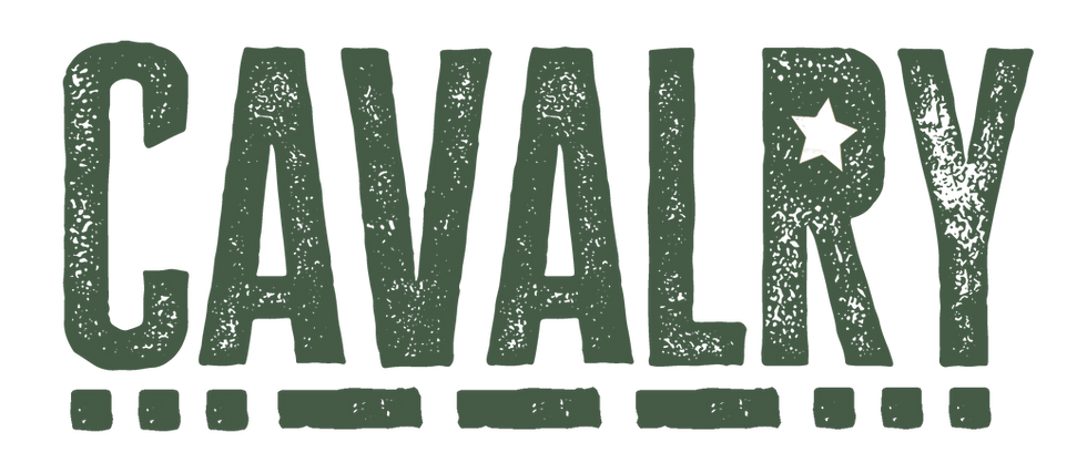
On the other end of the spectrum is the strategic, evocative name. This isn't a literal name, but a word that carries an immediate emotional or historical weight. Take the name Cavalry, for example.
"Cavalry" doesn't explicitly say "branding" or "web design." It doesn't need to. Instead, it provides a nuanced narrative. It suggests reinforcement. It suggests a specialist arriving to secure a situation. It carries an energy of support and professional backup.
When a name has this much atmospheric momentum, the job of the visual identity changes. It doesn't have to "explain" the service from scratch; instead, it has to fulfil the promise of the name. The design must be as reliable, structured and authoritative as the word itself. A strategic name gives the brand a head start, allowing the creative direction to focus on depth rather than just basic identification.
Checking under the bonnet first
Whether you are using an open canvas or a narrative lead, you cannot afford to skip the research phase. A name that feels right in your head can become a liability the moment it hits the market.
As part of my investigation process, I look for a few specific red flags. First, unintended connotations: does the word have a secondary meaning in a different context or culture? Then there's market saturation: if every second consultant is using words like "Pinnacle" or "Elite," you become invisible by being too familiar.
Finally, there's the practical side of legal and digital viability. Is the name actually yours to take? There is nothing more damaging than finding out your chosen name is trademarked by a competitor or that the digital handles are already dead accounts.
Finding your specific "look and feel"
Once the research is solid, the identity has one job: to translate the specific nature of your work into a visual language. Because your brand shouldn't have to "shout" what you do, your design must show how you do it.
Every expert has a different "frequency", a specific way of delivering results that is unique to them. My role as a designer isn't to apply a pre-set style, but to calibrate the visuals to match that energy.
This involves looking at the interplay between typography, weight, spacing and colour. For one professional, the design might need to feel structured to reflect their analytical rigour. For another, the same name might require a more open layout to reflect a collaborative approach. We don't categorise you into a bucket; we build the visual signals that actually represent your specific authority.
Thinking ahead to the website
A logo does not exist in a vacuum; it is the DNA of your entire digital presence.
When I am building a professional brand identity, I am already looking at the website's architecture. I am considering how the thickness of a line in your brand mark will translate into a navigation icon or how the weight of your chosen font will behave on a mobile screen.
The goal is total cohesion. The website should feel like a natural continuation of the name's narrative, acting as a high-performance hub for your business.
Matching the brand to the expert
The goal of a high-end identity is to ensure that when someone hears your name, they don't just see a label, they see an expert. By investing in the creative direction and strategic design of your identity first, you ensure that your presence carries the weight it deserves.
I provide the creative direction and strategic design established experts need to translate their expertise into professional brand identities, intentional websites and cohesive social media. If your name is an open canvas, I’ll help you paint the authority. If your name is already working hard, I'll make it unstoppable.


Comments